Bold colours have always defined Tudor, and the same black, red and white that have been pillars of its identity continue to uphold the recognisable brand (All photos: Tudor)
Sister to the Crown, Tudor is the more approachable sibling as compared to Rolex, but that does not mean it takes horology lightly. A steady release of cult and critically acclaimed timepieces, such as the fan-favourite Black Bay diver’s range, has earned the label its own seat at the table of serious watchmakers. However, it is careful not to take itself too seriously.
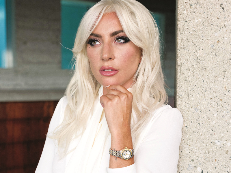
This spirit is epitomised in its appointment of the likes of Lady Gaga as brand ambassador. The two share an affinity for a solid foundation in their fields, energised by fun riff-offs and reinvention. Just as the classically trained singer-songwriter is renowned for her unorthodox style and spectacular performances, Tudor operates on horological know-how that dates back to 1926 and delves into a toolbox of vintage references and contemporary codes to create striking time-keeping instruments.
The Tudor Royal is one example. The regal handle, first adopted in the 1950s, made a comeback last year in an affordable range with a potpourri of personalities. Stainless steel forms the backbone of the series with certain two-tone models featuring gold accents. A selection of 14 dials across four case sizes (28mm, 34mm, 38mm and 41mm) increases the odds of collectors finding something they especially like.
lady_gaga_with_tudor_royal_28mm_1.jpg
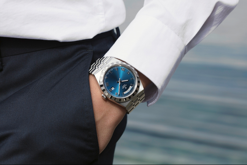
Dials are available in black, silver, blue or champagne with sunray motifs that radiate from the heart, while the women’s collection includes a mother-of-pearl option. Gleaming or glittering against these backdrops are applied Roman numerals or a ring of diamonds to mark the hours. All models wear a date function at 3 o’clock, but the 41mm iteration makes full use of its expansive dial to work in a day aperture at 12 o’clock.
So far so good, and the above elements are sufficient to make for a decent automatic watch. However, it is the attention lavished upon the bezel and bracelet that belies the pedigree of the watchmaker. The bezel features alternating polished surfaces and fluted blocks that frame the dial in a study of contrasts while the integrated metal bracelet bears an original “five-link” design first used by the brand in the early 1970s. The uninterrupted lines form a clean silhouette as if to counter the activity within the bracelet itself: each row has three wide satin-brushed links that are connected by polished links in twin parallel columns. Any movement of the wrist highlights the different finishings, and the bracelet is secured by a folding clasp with a safety catch.
The 34mm model with a blue dial spent a week on my wrist for a test drive. Tudor categorises the Royal as a sporty-chic entry but honestly, the timepiece feels more like a dress watch than one I would strap on for anything more vigorous than a run (though it should have no trouble holding its own). Although the sleek, satin-brushed and polished piece made me feel like I was all dressed up with nowhere to go, being mostly confined to home during the second Movement Control Order period, there were everyday activities aplenty to test out its comfort and hardiness.
tudor_royal_41mm_lifestyle_2_1.jpg
Stainless steel is popular in watchmaking for its lightweight durability and, after the first hour, I barely noticed the piece on my wrist. The ergonomic bracelet was adjusted to sit comfortably and I did not have to fret about scratching the metal while going about my routine. The date function proved especially useful in this hazy blur of days that has come to characterise time in lockdown, with little occurring to distinguish one day from another.
In fact, my only gripe is the 38-hour power reserve. The Tudor Royal sat on my desk over the weekend and that was enough to still the second hand. Getting it going again was easy, though adjusting the date took a bit of wrangling with the crown. On the whole, this makes for a great everyday watch with the day-date model in particular sure to leave an impression.
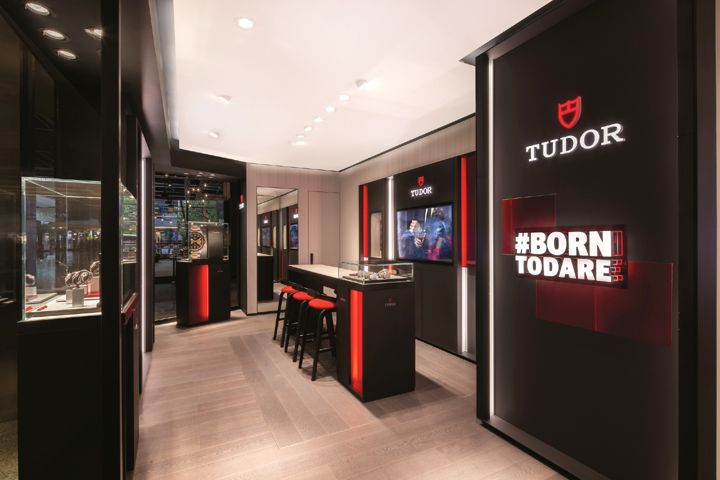
As the product, so too the place; the matrix of style, user-friendliness and functionality that is the blueprint of Tudor’s timepieces is reflected throughout the brand’s visuals, from its communication materials to its own boutiques. Its latest point of sale at Mid Valley Megamall unveils the new trajectory of its brand identity, characterising a more distinctive image.
Bold colours have always defined Tudor, and the same black, red and white that have been pillars of its identity continue to uphold the recognisable brand. These are splashed liberally across the boutique, from display panels and seating all the way to the designer lighting fixtures. The very architecture of the space has been reworked to keep with the new concept of placing products at the forefront of the Tudor experience.
tudor_boutique_mid_valley_megamall_5.jpg
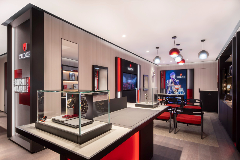
Evidence of this can be seen from a distance, with the façade — framed in black and fringed in red — boasting large visuals of novelties alongside one of brand ambassador David Beckham. Expansive use of glass at the entrance not only reflects a philosophy of transparency within the company but also offers a window to the world of Tudor timepieces.
Through the doors, glass displays rest on red-and-black pedestals or are fitted into wall-mounted shelving. To create breathing room amid the lashings of bold colours, a palette of neutral greys was injected and a judicious eye cast over the layout so that the displays simultaneously stand alone and work as a cohesive whole. Please browse, the boutique seems to whisper, with ample floor space to ensure customers have a semblance of privacy as they look around.
Graphic principles on current visual communications are transposed here to create an immersive microcosm of the Tudor universe. Prominent cues include the presentation of the slogan, red accents and superimposed images, as well as the individual flair of brand ambassadors. Just as a variety of surfaces and finishings evoke the dimensionality of its timepieces, they are applied here for creative effect: the use of satin-finish or brushed blacks, transparent reds and structured whites turn colours into veritable textures. A noteworthy conversation piece is a wall unit peppered with cultural paraphernalia on 12mm of felt, adding those final accents necessary to fully conjure up that Tudor flavour.
If in the mood to pick up a new timepiece — say, the Tudor Royal — the Mid Valley Megamall boutique is the experience you want. Soak in the vibrant energy of the brand here, then leave carrying a piece of it for yourself.
This article first appeared on Feb 22, 2021 in The Edge Malaysia.