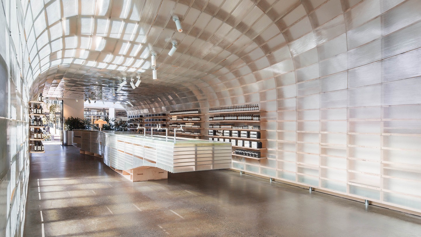
The store design at James Street in Brisbane evokes the soaring curve and watery light inside a surfer’s wave (All photos: Aesop)
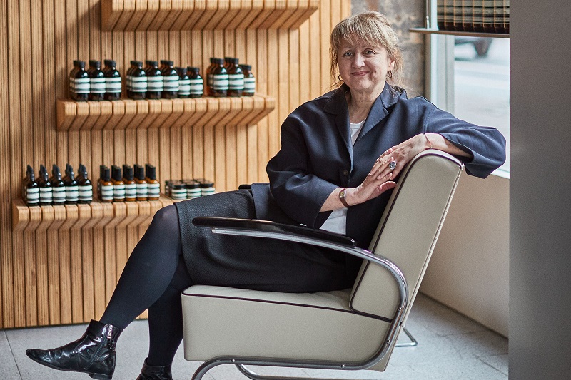
Aesop considers design as strong an expression of its thinking as products and packaging, says retail architectural manager Denise Neri. Three elements form the framework of every Aesop store: a single strong idea, a sense of place, and materials relevant to both inspiration and locale.
The Australian luxury skin, hair and bodycare brand does not follow a standardised approach for its design concept. Instead, it responds specifically to each location and space, building on unique features already in place, or creating new stories and ideas in neutral surroundings.
Placing the needs of customers first, it goes down well-trodden paths that lead to sites convenient for them but also explores those which “carry the promise of fresh discovery or revival”, says Neri.
large_jpeg-aesop_spokespeople_denise_neri_03_l.jpg
Supporting local vitality and expression and engaging with the neighbourhood to become part of the community spice up life in our increasingly connected world, she adds.
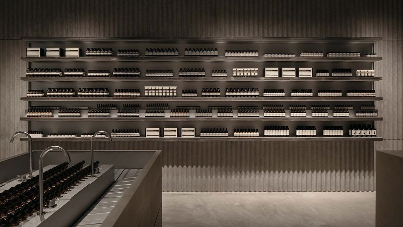
Just as you would invite a neighbour to your home, sales associates welcome customers as guests with tea, conversation and personal service in Aesop’s more than 200 stores worldwide, where the same grain of authenticity, relevance and individuality follows through in the design. These big words are grooved onto walls, shelves, ceilings and counters, sometimes with humble materials used in original ways, guided by the brand’s aim of stimulating all the senses and keeping a healthy balance between mind and body.
“We strip away everything that feels too obvious or literal. Wherever possible, we retain original features and add something of value,” explains Neri, who works closely with architects on store concept and design.
History and city make their imprint on the drawing board when the team sits down to discuss how each new store can embrace its location and space to tell its own story.
flinders_lane.jpg

Aesop James Street in Brisbane, created in partnership with Melbourne-based March Studio, evokes the soaring curve and watery light inside a surfer’s wave. Aquatic inspiration continues at Paddington in Sydney, where designer Clare Cousins lined the interior with finely grained pebble-mix reminiscent of vintage swimming spots. In Melbourne’s Flinders Lane store, Kian Yam of Studio MLKK created a rippled cardboard cave using 1,550 cardboard sheets.
The same quest for originality prevails beyond the home country. At Aesop 1 Utama in Petaling Jaya, Farm Studio used corrugated roof sheets to pay homage to Selangor’s tin-mining history. In Kuala Lumpur, Russell and George swathed the store at The Gardens Mall in warm caramel-toned oak. On another side of the city, in-house architect Chantelle Kramer designed the elegant oval interiors of the Pavilion KL store.
In some places, the architectural teams faced special building conditions but they approached them as challenges, not barriers to creativity.
aesop-1utama-.jpg
Heritage regulations forbid fixings to the wall at The Rocks Sydney, for example. March Studio got around that by developing a tensioned structure akin to the masts and ropes of yachts in the nearby harbour.
There were similar restrictions at Aesop’s recently opened store in old Amsterdam. Here, removable domed shelving units were inserted into existing wall alcoves and fixed sales counters were rethought as free-standing wooden forms sculpted by local designer Valentin Loellmann.
“Where spaces are smaller than ideal, they need to be expertly planned. Through design review, we try to share accrued experience from previous small stores and counters to reach intelligent space-saving solutions,” Neri explains in an email interview.
The designs differ wherever you go, but every Aesop store has key common features that deliver “an exceptional experience” to customers as well as staff, who spend long hours in them.
large_jpeg-au_store_the_strand_2.jpg
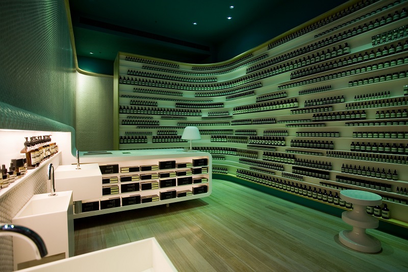
Step in and the first thing that strikes you is the scent — floral, citrusy, musky, woody or spicy — which vary according to store, season and local preference. Walk to a water basin and consultants will readily demonstrate products formulated from botanical extracts — cleansers, creams, serums, hydrators, oils and perfumes — packed in the brand’s signature amber glass bottles.
The lighting is warm and mellow and there is music. There is tea from a metal pot and cosy seating for those who seek a calm respite from heat, traffic or the busyness of the day.
“It’s not only design, but also a series of seemingly minor decisions and subtle calibrations that align to make our spaces captivating and comfortable. Like the pieces in a well-coordinated wardrobe, these individual components form an integrated, harmonious whole.”
Does good store design impact footfall?
“Design creates awareness and adds to a satisfying experience in-store but history shows footfall depends on other factors,” Neri says. What drives customers to a store are product quality, exceptional customer service and location.
“Our stores are designed for the comfort and sensory delight of our customers and staff, and to be long-lasting. The pleasure and well-being that good design engenders is a natural consequence and valued, but not quantifiable,” she adds.
This article first appeared in issue No. 94, Winter 2019 of Haven.