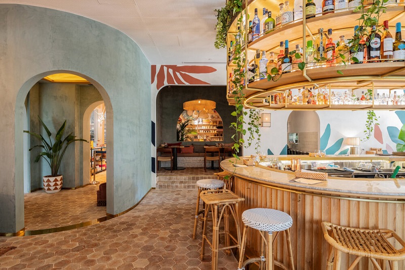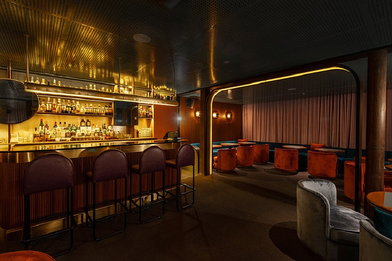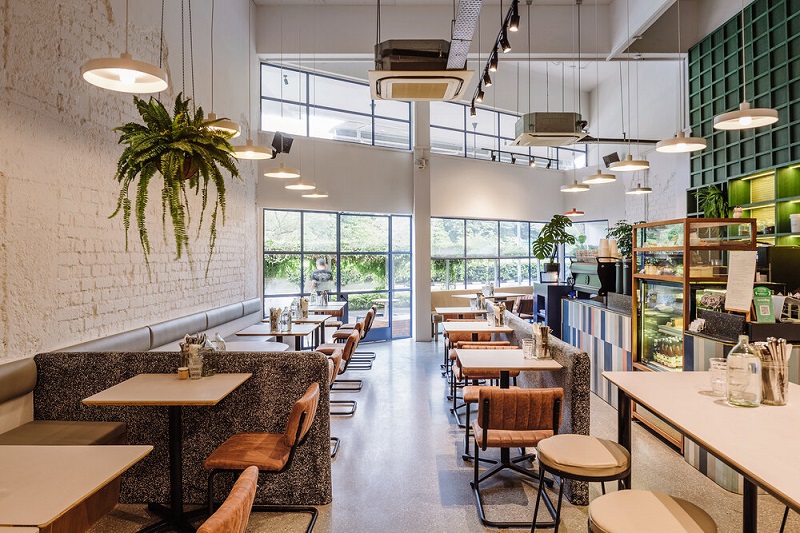
Lim's first significant project as an independent designer was Lucha Loco at Duxton Hill (Photo: Hui Designs)
Interior designer Lim Siew Hui has been observing spaces and décor of people’s homes since she was eight or 10. But she didn’t think to turn her hobby of sketching into a full-time career until her sister brought home her future husband, Vincent Koh of Environment Design Consultants in KL. Enamoured by his stories on interior design, Lim decided to turn her passion into a lifelong pursuit.
Haven: Could you tell us a little more about the work you do and how you inspire yourself for each new project?
Lim Siew Hui: When I started Hui Designs, I made the decision to focus on F&B projects as well as selected commercial ones as that’s what I truly enjoy working on. Whether it is a French-inspired design for the Merci Marcel group of cafés or the Loco Group’s urban Mexican theme for its establishments, I take time to research, listen to my clients, translate, visualise and realise their vision — which is the role of a designer. These projects allow me to create spaces with personality, heart and soul — which I find lacking in many establishments — and propose creative possibilities for them.
Every project, big or small, excites me and I am very lucky to be asked to work on an interesting and diverse range of projects. My clients have also allowed me to be creative and they push my boundaries. I often ask them these questions so I can better understand them and what they want to see in the design: What type of restaurant is it? What kind of cuisine does it offer? Who are the target customers? Will the restaurant be serving lunch or dinner, or is it an all-day dining space? What do they want diners to feel and experience? What is the percentage allotment for bar and restaurant? For example, is it 60% bar and 40% restaurant focus, or the other way round?
mercimarcelorchard-25.jpg

Creating the appropriate ambience for the project is key to my design approach, regardless of whether the restaurant is themed or not. For example, my clients invited me to Mexico for a research trip when I was working with Lucha Loco in Singapore. I wanted an urban restaurant with a Mexican spirit, one that would feel right at home in Mexico City or Williamsburg, New York. It was a beautiful corner shophouse on a hillside with an outdoor space, so we turned that into an inviting garden for al fresco dining and drinks, similar to the outdoorsy places you might find in Tulum, Mexico. I love greenery and wanted the landscape to be integrated into the garden. So we introduced arbours and also engaged John Lim of This Humid House to create a cacti garden at the front entrance, which became integral to the design and ambience we wanted to create.
Would you describe your approach to design as more structured or intuitive then?
I have always approached my designs intuitively. The restaurant’s location and site are always key when determining its design and ambience. For me, it’s all about getting a feel of the place, understanding the space and listening to my instincts on what can or can’t work. I create with these feelings and like to embrace the space, working with existing structures as much as possible. For instance, before my client signed the lease for what was to become Privé at Wheelock in Singapore’s Orchard Road, he invited me to view the site. We sat at what was then a chain coffee shop and he asked what I thought of the location and space. Sitting there, feeling the space and watching the tourists, shoppers and office workers walk by, I immediately saw the potential for Privé to transform the area’s vibes. I designed Privé at Wheelock to be a spot where one can “watch the world go by”, drawing inspiration from the sidewalk cafes in Paris where the chairs face the sidewalks.
prive.jpg

Do you also consider other elements, like music, for a space?
Selecting a music playlist for an F&B outlet is not my forte but I recognise its value in creating the mood in a space. I may say something if I feel the music does not complement the atmosphere of the space. However, I have been fortunate. All my clients have good taste in music.
Was there an epiphany, when you knew interior design was what you wanted to do?
I did not have an epiphany. However, I recall observing spaces and the decor of people’s homes since I was eight or 10 and I was sketching a lot. But at that age, you don’t think about your career. However, when university beckoned, I had friends studying architecture and thought that was what I should do as well but I was not ultimately convinced, seeing how hard they were working, spending nights in the studio. All that changed when I was 16 and my sister brought her future husband home. He told me what he did, describing it to me in detail. It was then that I knew the “thing” that I showed interest in is called “interior design”. My brother-in-law, Vincent Koh of Environment Design Consultants in Kuala Lumpur, has been a major influence in setting my career path. However, I would like to say that I don’t see this thing I do a career. It’s something that I truly enjoy and am passionate about.
What was your first significant project though? And what were the lessons you learnt from it?
My first significant project as an independent designer was Lucha Loco at Duxton Hill. It reaffirmed my decision to focus on the F&B businesses and the fact that I very much love creating concepts and designs for restaurants and cafés. The first lesson I learnt about the industry? To bear in mind that every project has a budget!
jp-20new.jpg

What advice would you give to budding designers?
I would say: (1) Don’t just follow trends; (2) ensure the design befits the product; and (3) create with feelings.
What is your own home like?
My own home is simple, cosy and slightly eclectic. I don’t like to hoard, so I am constantly decluttering and getting rid of stuff I no longer need. My favourite room is my living room, which has a balcony where I grow some plants. I love to be close to nature and I love long walks and enjoy the outdoors. So, the balcony is the one space that allows the outside to come inside.
What, in your opinion, makes a house a home?
A home should embody the spirit and personality of the occupier. In the past, when I designed residential spaces, I would often spend time with my clients and query them about their lifestyles and their likes and dislikes before I proposed a design. I would often encourage them to keep heirloom pieces and I’d see if I could work them into the space. These items add personal meaning to the space and create a sense of depth for the design. A home should not look too perfect; not everything in it has to be well matched or stylised. I love the idea of perfect imperfection. It makes the living space more human.
atlascoffee-1082.jpg

How do you ensure comfort prevails without sacrificing luxe, beauty and warmth?
For me, form must always follow function. I have never thought that to have one means you cannot have the other. Comfort and aesthetics can go hand in hand. To me, a functional design is a good design. A design that takes into consideration the user’s requirements is essential.
Chinese New Year is coming up. Do you have any easy tips to give the home a fresh look or sense of newness without having to tear walls down?
There is no one rule to do these things as every home is different. However, I find that you can achieve a fresh look by just changing one or two things in the home. For instance, why not repaint the walls or rearrange the furniture and artwork, or even start decluttering? I also prefer plants over flowers as they are evergreen and tend to last longer.
Which countries or places do you like revisiting for inspiration?
Inspiration is everywhere. I love visiting new places, especially countries which are still underdeveloped. People tend to be more creative and innovative in these countries because they do not have the mod cons of urban life. What excites me most is stumbling across authentic, original designs. A good design is one that is an interpretation of what is true to the culture; one that embraces its provenance, values and uses local materials and ingredients.
The next time you are in Singapore, check out these chic spots to get a sense of Hui Designs’ style and flair. If you cannot get to the Lion City, visit the company’s latest project in Malaysia, Ben’s KLCC.
1. Chico Loco on Amoy Street.
2. All three Merci Marcel outlets — in Tiong Bahru, on Club Street and the latest one that just opened at Palais Renaissance on Orchard Road.
3. Privé in Tiong Bahru. In fact, all Privés outlets are different; also check out Privé at the Asian Civilisation Museum.
4. Jigger & Pony Bar at The Amara Hotel, which is among the 2019 World’s Best Bars award winners.
5. Atlas Coffee House at the corner of Duke’s Road and Bukit Timah Road.
This article first appeared in issue No. 94, Winter 2019 of Haven.


